Client
Industry
Finance | B2C
Services
Branding
Event
Graphic Design
Platform
Digital
My Role
Visual designer
Timeline
Jan 2022 - Present
Brand expression guideline project and collection of marketing design collaterals created during my tenure at Morningstar Australia.
Our Brand expression
In a world that’s overrun with noise, we stand for clarity. Our brand expression is a testament to the beauty of simplicity, drawing inspiration from the esteemed traditions of Scandinavian and Swiss design.
At Morningstar, we embrace the ethos of minimalism, where every element serves a purpose and nothing is inessential. Our palette is restrained, our use of negative space deliberate, and our imagery speaks in natural tones, resonating with the authenticity of the world around us.
In adhering to the principle of "less is more," we invite you to embark on a journey through our expression guide—a realm where elegance meets functionality and simplicity reigns supreme.
My Role
Visual designer
Defining the problems & goals
The problem
'How might we establish a comprehensive brand guideline that aligns seamlessly with Morningstar's brand identity and ensures consistent application across all brand expressions"
Goals
Morningstar Brand expression is designed to support creators in bringing the Morningstar mission to life. These guidelines provide the visual and verbal framework needed to deliver positive and consistent brand expression to anyone who interacts with Morningstar, at any level.
Everyone—no matter their role—can be a Morningstar brand ambassador. Applying Brand System principles to our work is just one way we showcase our mission to empower investors, build trust, and illuminate investing for all
The Process
Our journey began with a thorough analysis of existing marketing assets, gathering insights, and identifying gaps in consistency. We conducted stakeholder interviews and collaborated closely with the Global Marketing Design Team to uncover insights and consistency problems they had in the past to align our brand expressions. This investigative phase enabled us to align design objectives with business goals by meticulously mapping all available marketing collateral and templates, and determining how to consolidate and align them with marketing needs.
Below are some screenshots of our collaborative FigJam sessions and early brainstorming ideas, showcasing our needs, wants, and implementation strategies.

The Brand Expression
We created a Brand expression guideline that can be used widely within the organization and align with our design vision. This is the extension of our Global Brand guideline. As designers and marketers, we are the architects of our brand narrative, entrusted with the task of translating our values into compelling visual experiences.

Our Expression
In a world that’s overrun with noise, we stand for clarity. Our brand expression is a testament to the beauty of simplicity, drawing inspiration from the esteemed traditions of Scandinavian and Swiss design.
At Morningstar, we embrace the ethos of minimalism, where every element serves a purpose and nothing is inessential. Our palette is restrained, our use of negative space deliberate, and our imagery speaks in natural tones, resonating with the authenticity of the world around us.
In adhering to the principle of "less is more," we invite you to embark on a journey through our expression guide—a realm where elegance meets functionality and where simplicity reigns supreme.
Brand Colours
In a sea of conservative greys, blues, and greens, we're charting a new course with Morningstar Red. This vibrant hue isn't just a color; it's a statement—a symbol of our fearless approach to finance and our commitment to standing out in a crowded market.
While others shy away from red, associating it with caution and risk, we embrace it wholeheartedly. We're rewriting the narrative, proving that red isn't just a warning sign; it's a beacon of opportunity and innovation.
Our suite of red hues, carefully curated to complement Morningstar, represents a new chapter in our brand journey. From deep crimson to fiery scarlet, these shades evoke passion, energy, and the courage to take bold leaps forward.
Colour Theory
Adopting the 60–30–10 rule for colour schemes in web/print design draws inspiration from the principles of interior design, ensuring an appealing visual experience for users. Here's how it works: allocate 60% to the dominant colour, 30% to a secondary colour that complements it, and reserve 10% for accents that highlight key elements. This intuitive approach creates harmony, guides user focus, and enhances overall aesthetics, resulting in more engaging and memorable designs.

Secondary Colour
In the realm of charts, asset allocation, and diagrams, secondary colours play a pivotal role in enhancing visual clarity and comprehension.
While these hues typically don't take centre stage in primary branding, they serve as reliable companions, imparting depth and differentiation to data representation.
Our 5% hues can be used as neutral backgrounds, these hues provide subtle differentiation. Used sparingly, they highlight categories and subtle visual differentiation, aiding swift comprehension and informed decision-making, while ensuring visual harmony and clarity.

How the expression shows in creative
The value of a brand is directly connected to how it is perceived and experienced: from first point of contact to purchase, product use, support, and every touch point between. The consistency of the holistic experience separates the strongest and most valuable brands from those that are managed superficially and without integrity.


For more info on Brand Guidleine please visit Morningstar Brand System.
Other works

Website Design | AM Advisory ServicesWebsite Design
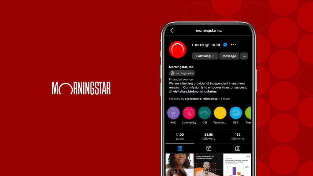
Visual Design | MorningstarMarketing Design

Morningstar.com.auUI/UX Design

MorningstarUI/UX Design

Noice AppMobile application design

Vessel Furniture - BSeated GlobalWebsite design
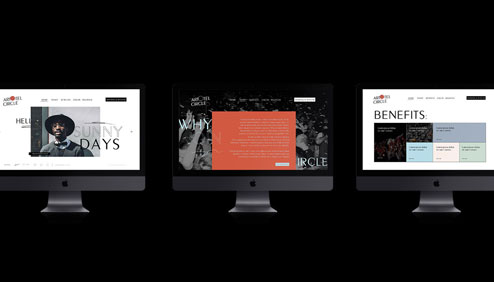
Artotel CircleWebsite design, Logo design

Artotel Company ProfileCompany Profile

LegacyMobile Application Design
Thanks for visiting!
© 2025 Sylvia Anggreni